Designing an Onboarding Journey
At Toptal, what began as a tricky copy improvement evolved into an overhaul of the entire onboarding experience, requiring a months-long collaboration among four teams.
This is a showcase of how numerous business pipeline problems were solved with UX improvements.
I. A Long List of Problems
Toptal is a freelance platform that caters to expert talent and corporate clients. We conduct a rigorous vetting process for freelancers, accepting a small percentage of applicants into our talent network.
Similarly, we conduct a filtering process for our clients as well – we prefer long-term, reliable clients with a clear freelancer criteria in mind.
This filtering process plays a big role in the client onboarding journey.
During signup, a prospective client would be asked a “budget question” – how much were they planning to spend on a freelancer?
Upon joining the Signup Team, my first task was to improve the copy on this question – when users reached the “budget screen”, 30% of them would close the tab.
When I opened the Figma file for our signup flow, I was shocked. The drop-off rate caused by the budget question was far from our only problem.
In order to complete signup, potential clients were asked to:
- Choose between three services (hire a single freelancer, hire a team of freelancers, or work with Toptal’s new consulting service)
- Choose their company size
- Choose the role they would like to hire
- Input the skills they’d want a freelancer to have (via a selection widget)
- Input their email
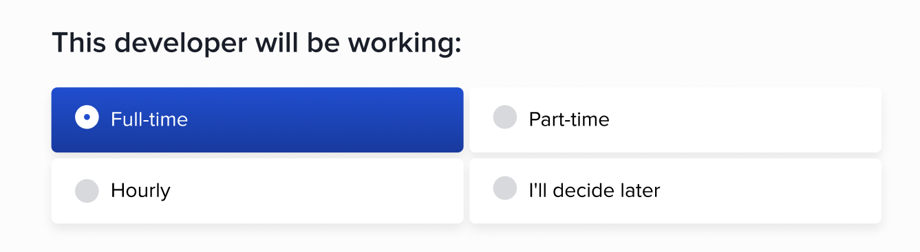
- Choose the freelancer’s time commitment (full-time, part-time, or hourly)
- Choose the preferred start date of the freelancer
- Choose their budget level
- Schedule a Call
Each of these questions were on separate screens.
Note that, at this point, users had not seen the profiles of any freelancers in our network, nor had created an account. We were asking for too much commitment and patience.
I rewrote the budget question (and its multiple choices) to align user reactions and our intentions as best as I could, then I reached out to the Signup Team PM to discuss the signup flow as a whole.
The two of us identified several problems:
- The budget question was misplaced – it shouldn’t be surfaced during onboarding, and it was costing us leads.
- The signup flow was too long. A prospective client needed to answer eight questions – each question was given its own screen.
- After a user had gone through eight screens, they still did not get to create an account. They needed to schedule a phone/Zoom call with a sales representative for verbal vetting (and some service upselling). I reached out to our SMB sales team, and read their script: they repeated several questions we asked during the signup flow. This “schedule a call” screen was causing even higher drop-offs than the budget screen.
- While clients experienced one (long) onboarding journey, separate teams were maintaining its components along the way. Cracks were showing during handoffs.
In short, we did not have a cohesive onboarding journey; 80% of leads never reached the end point (posting their first job request).
II. Scope Expansion Strategy
After a long discussion, the Signup Team PM and I agreed on our goal: to overhaul the signup flow and produce a quick, coherent onboarding experience.
However, both the PM and I were new to the team, and the long signup flow had been in place for a decade. To get buy-in from senior stakeholders, we needed to propose incremental changes and gather test data at every step.
Here were the five changes we outlined:
- Remove the “budget question”.
- Remove the questions which Sales also asked.
- Move all remaining questions onto one screen.
- Embed the signup flow (now a single screen) into our landing page, rather than its own tab.
- Move the sales call to after account creation.
- Removing the Budget Question
First, I worked with the UX Research team to gather user feedback on the Budget Question screen. A week of surveys and interviews revealed significant friction:
- Some users were unclear on their own budget
- Others were uncomfortable with sharing this information
- The question caused general mistrust and confusion
The insight was clear: this screen had got to go.
I developed a hypothesis (removing the Budget Question would increase conversion significantly), and the PM gathered senior stakeholders for a presentation. During the presentation, we advocated for a two-week long A/B test, justifying it with our hypothesis, user feedback, and conversion metrics from the past four weeks.
The test was approved, we ran it, the results validated our hypothesis (conversion from the flow without this screen was significantly higher than from the control), so the screen was removed.
- Removing Redundant Questions
For this step, I listened to several sales recordings (via Gong) to verify the redundancy. Then the PM and I met with SMB Sales team leads – we wanted to ensure that removing the questions from our flow wouldn’t impact Sales operations or lead quality.
The meeting was fruitful; we agreed on another A/B test. In the following two weeks, we interviewed sales reps about their most recent calls with users. There was no significant difference in terms of user behavior between the normal flow and the shortened one. Furthermore, the drop-off rate on the shortened signup flow was much lower. Our hypothesis was validated once again, so the redundant questions were removed.
- Merging Question Screens
State of the signup flow, after removals:
- Choose between three services
- Choose their company size
- Choose the role they would like to hire
- Input the skills they’d want a freelancer to have
- Input their email
- Choose the freelancer’s time commitment
- Choose the preferred start date of the freelancer
- Choose their budget level
- Schedule a Call
We've reduced the number of screens (and friction points) from nine to five.
After two successful tests, the team was in a better position to advocate for even more significant improvements.
To me, the very layout of the signup flow ran counter to sensible UX design. Eight separate screens multiplied the number of clicks for users, they added no value, only friction throughout the experience; with each additional screen, the chance of a user drop-off increased.
I worked with our designer to mock up and iterate on a single-screen signup component. Meanwhile, our PM worked with Engineering to ensure their capacity on implementing our design.
I rewrote the remaining questions and their choices to be scannable and quickly digestible. Long, ambiguous questions such as:
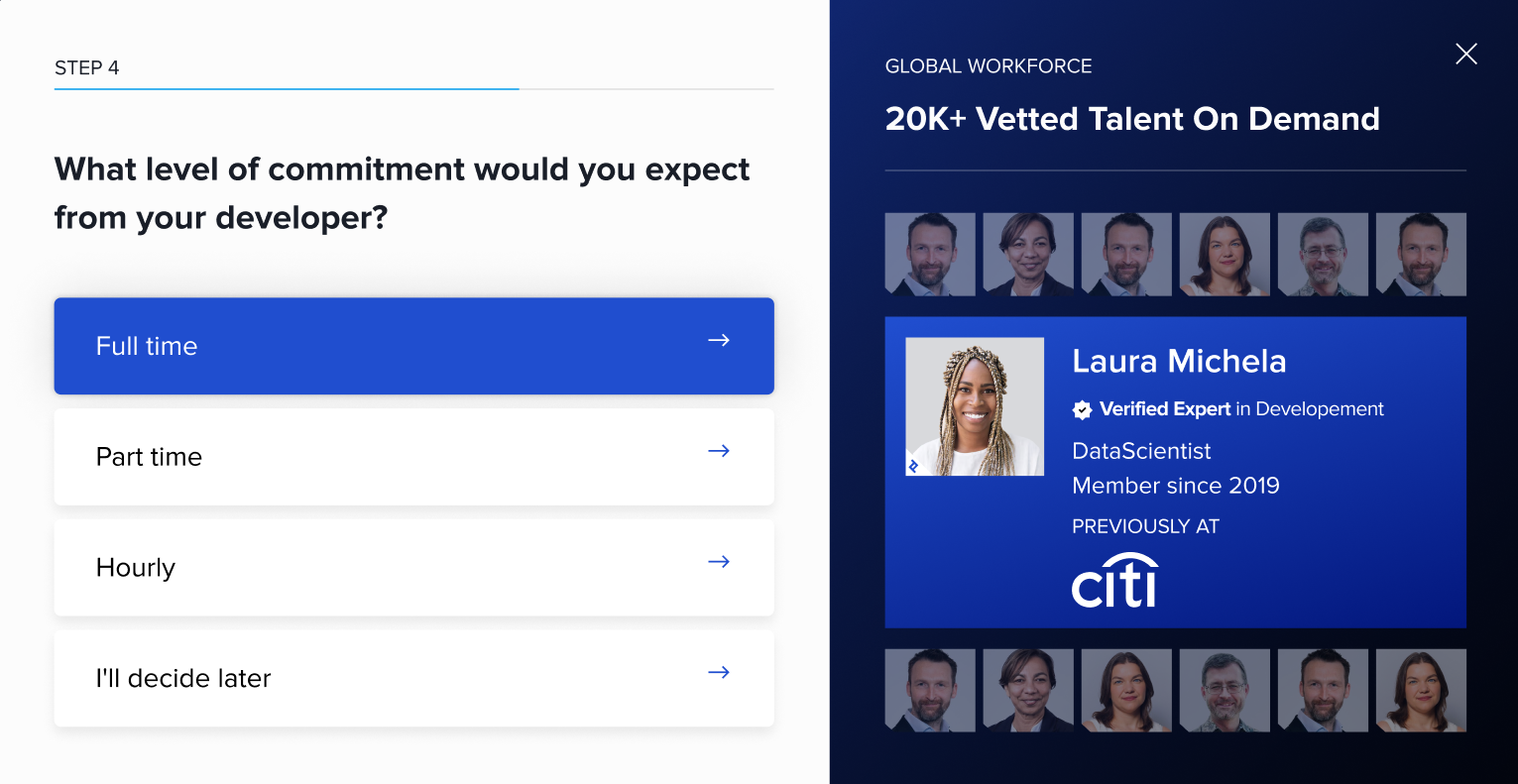
Became:
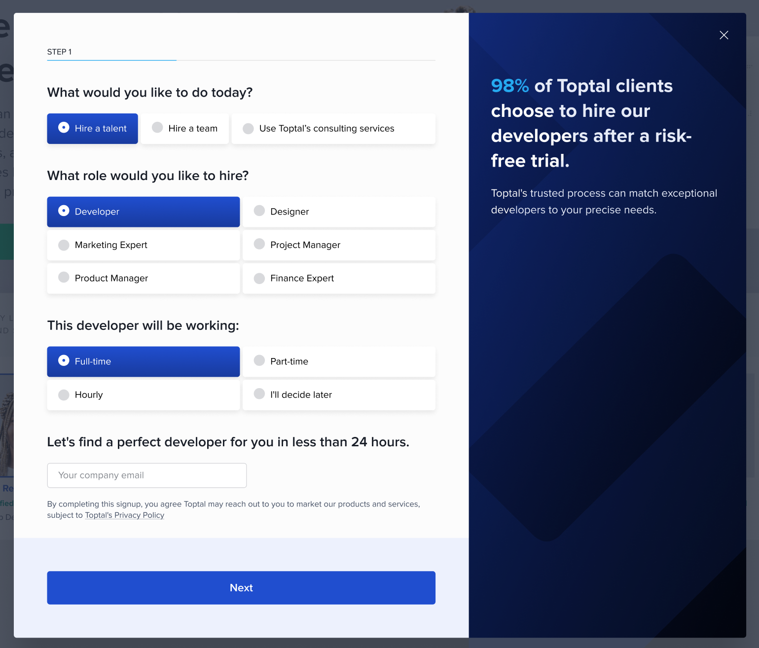
After weeks of data gathering, building stakeholder relationships, and iterations on our legacy signup flow, my initiative was finally fulfilled.
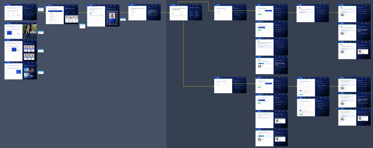
The long flow changed from this:
To a single component:
- Further Changes
It took yet another two weeks of testing for senior stakeholders to approve a site-wide use of the single screen signup component. The team built on this and advocated for embedding the component into our landing pages, rather than opening its own tab.
We then used our increased influence to propose broader initiatives, including reshaping the post-signup flow (moving the account creation step to before our vetting call) and redesigning the UX of account setup.
*****
Through months of strategizing, iterating, and testing, the Signup Team successfully built relations with senior stakeholders, Sales, and Marketing.
We are now leveraging those relationships in order to unify language and design across our landing pages, signup component, account setup flow, and call script. This will move us substantially closer to the end goal: creating a cohesive onboarding journey.